Building Salv’s identity, part 3: developing the brand identity

This post is part of a series on how we developed Salv identity. Also read the other posts in the series:
- Part 1: History, mission, and name
- Part 2: Producing the design
- Part 3: Developing Salv’s brand identity
Getting the salv.com domain
There are probably two kinds of four-letter .com domains:
- in active use
- bought up by domain resellers, waiting to be resold
Fortunately, salv.com appeared to be in the second bucket: no active user or trademarks had claimed it yet, and it was available for purchase.
We contacted the seller and were able to negotiate a reasonable price to acquire the domain. It took some back and forth but, in the end, it worked out. Though we spent more than we’d originally budgeted, it wasn’t nearly as bad as it could have been. Having been around for awhile, I’ve personally heard of magnitudes-larger domain purchases.
We had a backup plan with alternative domains in place that had the all-new .io or .eu or .ee But, fortunate for us, our main plan of obtaining salv.com worked out. It wouldn’t be the end of the world to use an alternative top-level domain, or a variation of the Salv name, but it felt like having a “dot-com” is still the gold standard and adds a bit of extra credibility.
The 3 lines element
You’ll see Salv’s “three lines element” as a visible marker of the Salv identity in various locations.

salv.com is based largely on typography and color. Besides the product screenshots and photos of our team, at the moment there’s minimal imagery. Still, we wanted to have an element to liven up and bring some interest to the composition. Priidu had an idea to try abstract shapes based on our brand colors.
Here’s the first version of our three lines element, as it appeared on the website during the development phase. You’ll notice the rest of the page is work-in-progress too, and quite different from what we have up now.
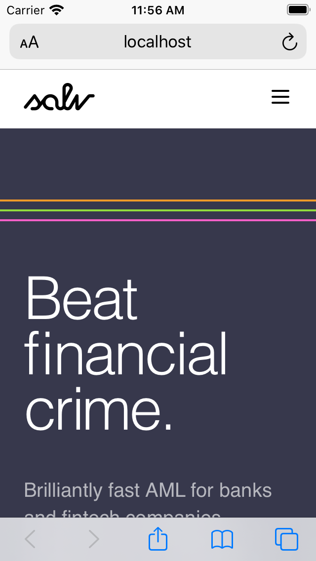
This version wasn’t really speaking to me. The first thing it evoked in my mind was the Olympic Games or some other sports theme. Though it felt like it had potential, the execution somehow fell short. Nevertheless, we kept exploring, until we finally arrived at the version with broken lines that you now boldly see on our site and other materials.
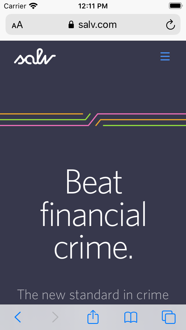
When I saw the lines in its current format, with broken lines, the element suddenly became much more interesting and connected with our mission. Looking at it suddenly feels like it’s in the middle of telling a story. What’s the story about? What are the broken and connected lines? Are they the criminal flows of money that we want to stop short? Or are they the opposite fates of people like human trafficking victims, whose lives are broken by perpetrators of financial crime, and we want to restore those lives and fates?
We didn’t provide a definitive answer as part of the brand project. But we do invite you to join our journey and the conversation.
So, what’s next?
Salv officially launched its new identity in December 2019 and we’ve received lots of encouraging feedback. We feel the identity represents who we are and what we want to be.
Those of you more familiar with brand development will notice that two common sections are missing above: voice and tone, and visual imagery. Indeed, we launched our identity’s first version without fully fleshing those out. Here’s why we chose to postpone these parts.
We operated with customers already before we re-launched as Salv, and the one insight we have from our past many months is that our work puts us in front of a huge variety of stakeholder groups. From the largest banks, government agencies, industry bodies, all the way to just a few guys in a fintech startup, we encounter great variance in the expectations to how we engage our partners, including our tone and approach.
At the moment, we don’t yet know enough to formulate a coherent voice with appropriate tone variations for all these groups. We’ll of course be gathering insights and taking notes as we go. Eventually, we expect we’ll formulate our verbal and visual voice and tone in the coming months based on recent real-life learnings.
Nothing is forever in the digital world, and we haven’t set our identity in stone. It serves us well today, but our sights are already in the future. Beyond formulating our voice and tone, we expect to keep refining and developing our identity. We’ll revisit all the elements as needed as Salv gains traction across countries and industries.
Thank you
Oh, and I want to thank Priidu Zilmer, who was my creative partner on this project and did most of the actual creative and production work. Thank you to Jeff and Tiina who kept the project on track and drove it forward with lots of insight and contribution, and to all other Salvers who gave us helpful feedback and ideas.


